Tuesday, May 15, 2012

Gentle Push, 11" x 15", Pastel painted on Canson paper

I finished this one up today. I really only tweaked some areas, I didn't make any big changes. This was a first for me, a seascape, so I treaded somewhat carefully. I'm thinking the next one will be on sanded paper with a watercolor underpainting. Pastels are way too much fun - it should be illegal!


© by Christine DiMauro, all rights reserved.

Saturday, May 12, 2012

Gentle Push, Pastel painted on Canson paper (felt gray), 11" x 15"

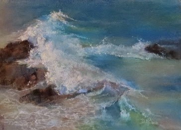
This is currently on my easel.  I went to Maine last summer, and I took tons of reference photos.  We were on the coast, so I got lots of water photos.  This was taken at a resort in Ogunquit, Maine.  I was above the water on a path going along the coast.   It was a beautiful spot, the ocean was so clear and the foam so bright.  I was able to zoom in with my camera and capture the swirl of the water against the rocks.

It is the first time I've attempted a seascape, and I'm finding I quite like it.  It's much like scribbling with pretty colors while trying to get the foam patterns believable.  It's not done yet, I've got some tweaking to do in the upper right and left areas, as well as below the right hand rocks.  Also, the bottom left foam needs a bit more tweaking.  I may enhance the foam at the tops of the waves too, maybe some warmer lights to lift the wave.

I'm currently using my 80 pc Plein Air Sennelier half stick set, along with my Plein Air Ludwigs.  The softies are really working well for this subject.

© by Christine DiMauro, all rights reserved.

Sunday, May 6, 2012

Lost in Thought, workshop sketch cropped, painted using Girault pastels on Canson paper

I came across this old workshop sketch that I did quite some time ago.  This was done in about an hour, which is why it has that unfinished look.  I thought I would share it here because for some reason it was and still is a favorite of mine.  I cropped it to a square format because there was something going on that I didn't like, yet I was pleased with the bold colors I used in the skin tones.  I know it seems a bit "out there" with regard to the colors, yet for me it somehow works.  The photo is a bit fuzzy, I may try to take it again to get a clearer shot (This will require some digging through my old sketches, though I'm sure it's in there somewhere!)  The square format seems to work as a "save", though IRL I didn't crop it yet.  I just might though, it looks interesting this way.

© by Christine DiMauro, all rights reserved.